Prakt is a design practice founded by Matti Tuominen, specializing in brand identity and digital product design.
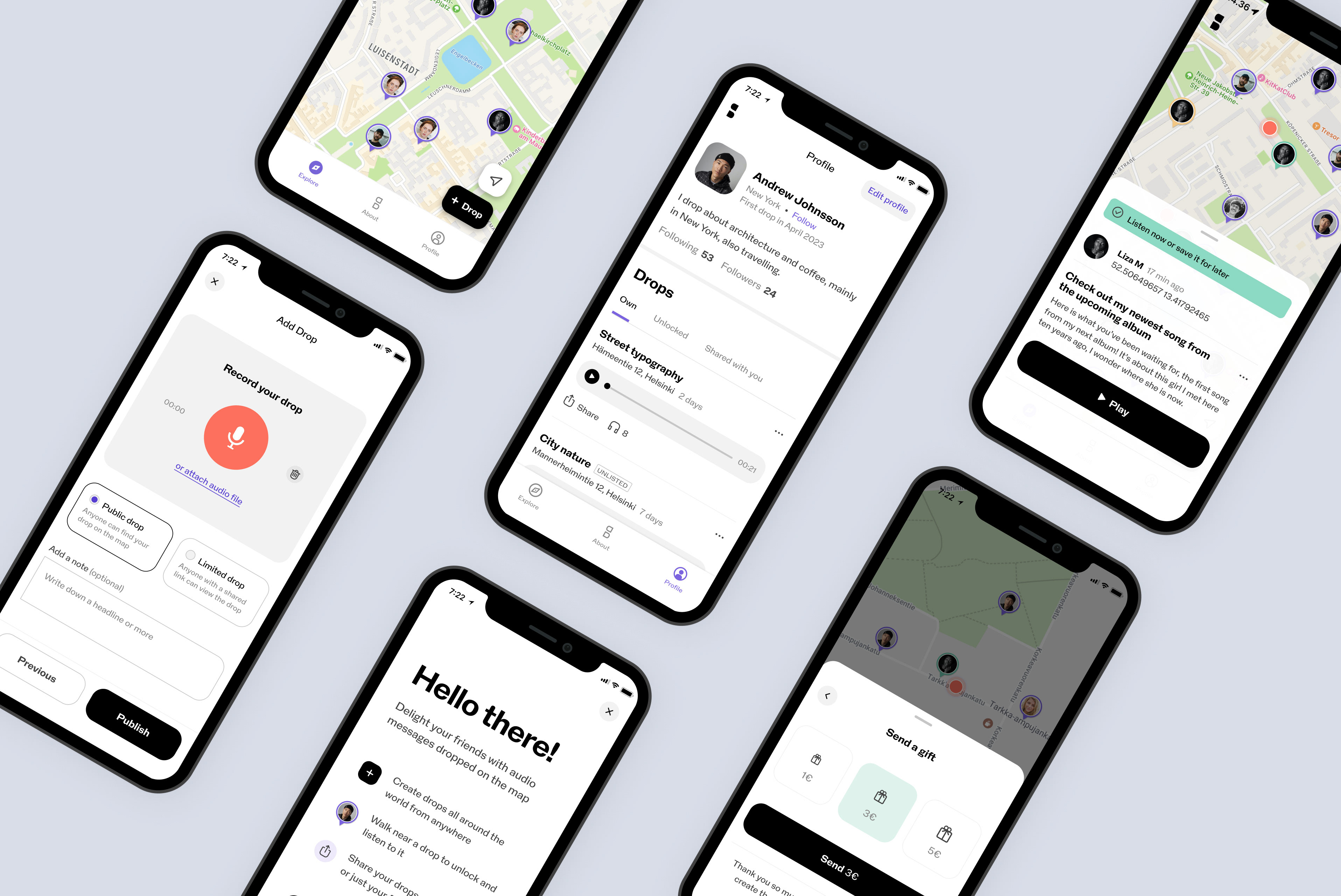
StoryDrops App
Brand & Product Design

Hurtigruten
Mobile App Design at Reaktor
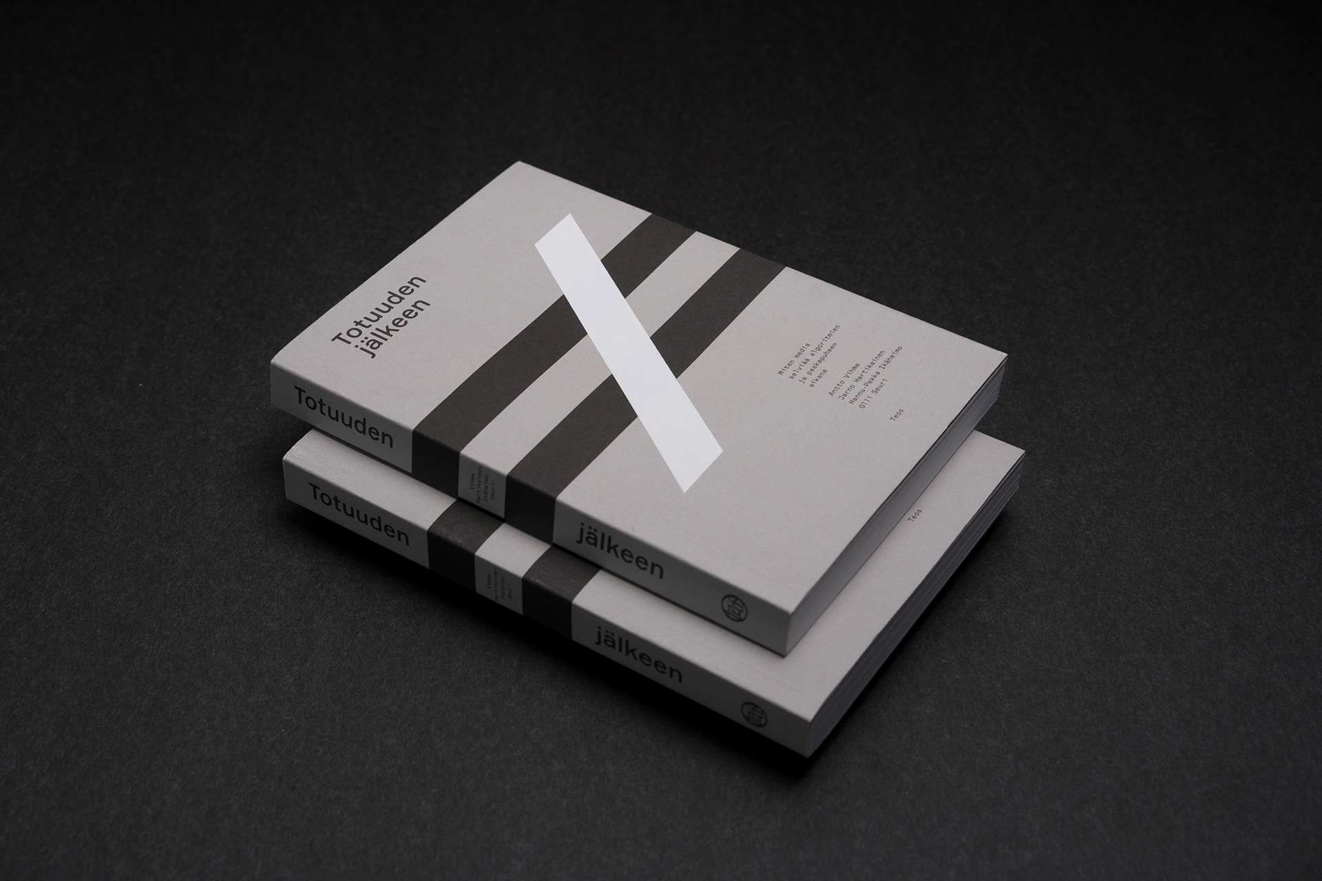
Post-truth
Publication Design
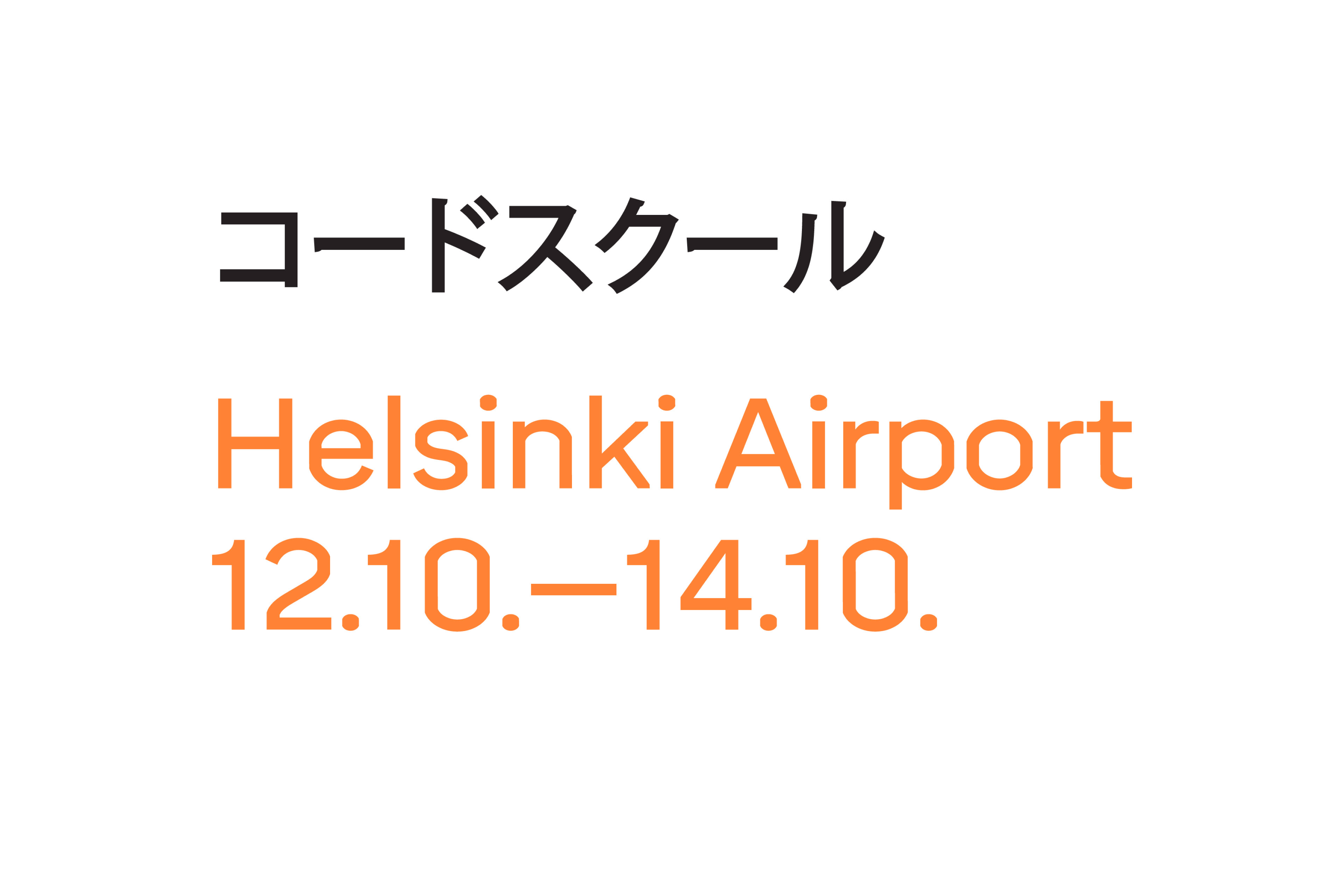
Reaktor × Lego Code School
Identity & Product Design at Reaktor

Logos & Marks
Logo Design
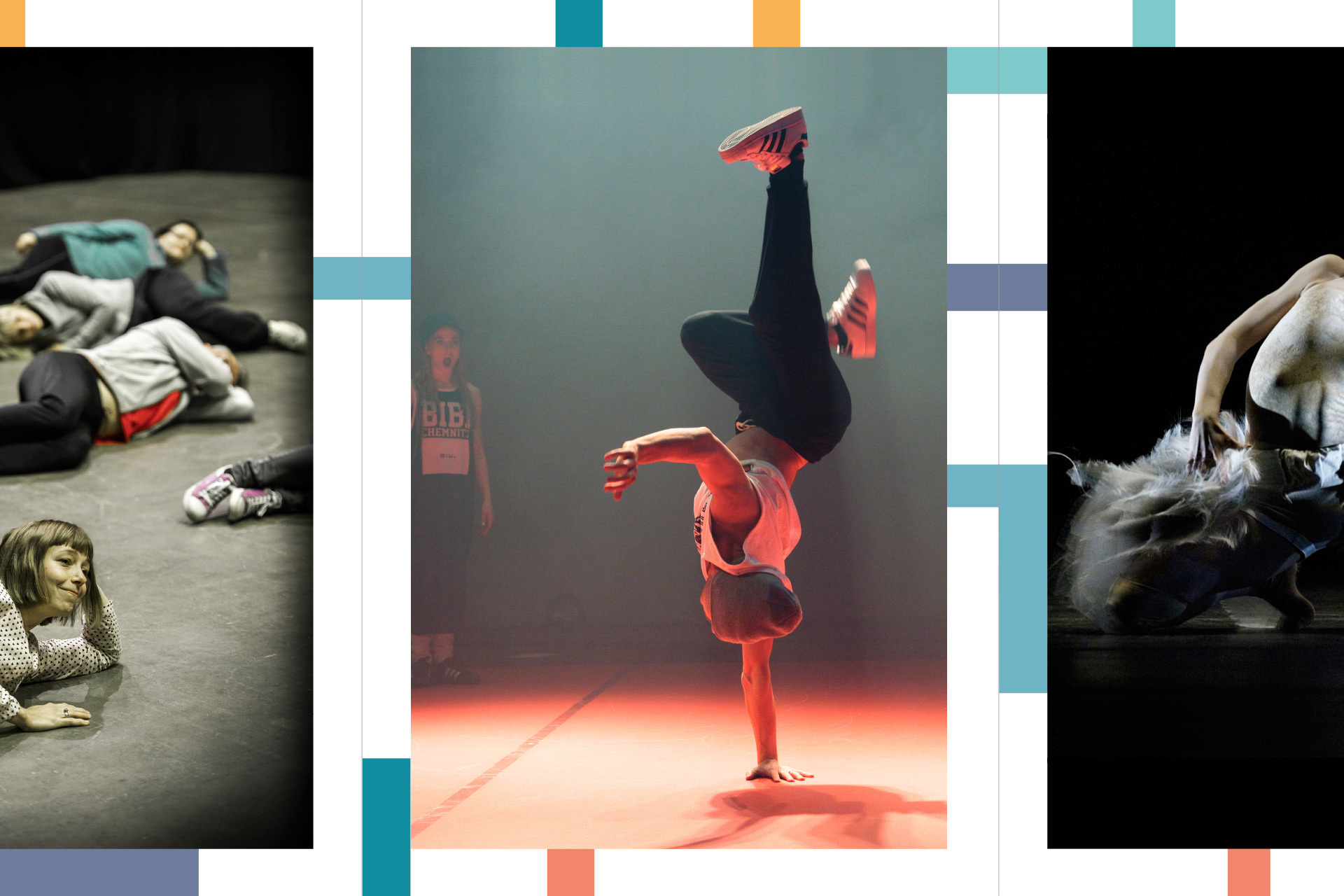
Dance House Helsinki
Brand Identity

Holvi Payment Services
UI Icon Framework & Guidelines
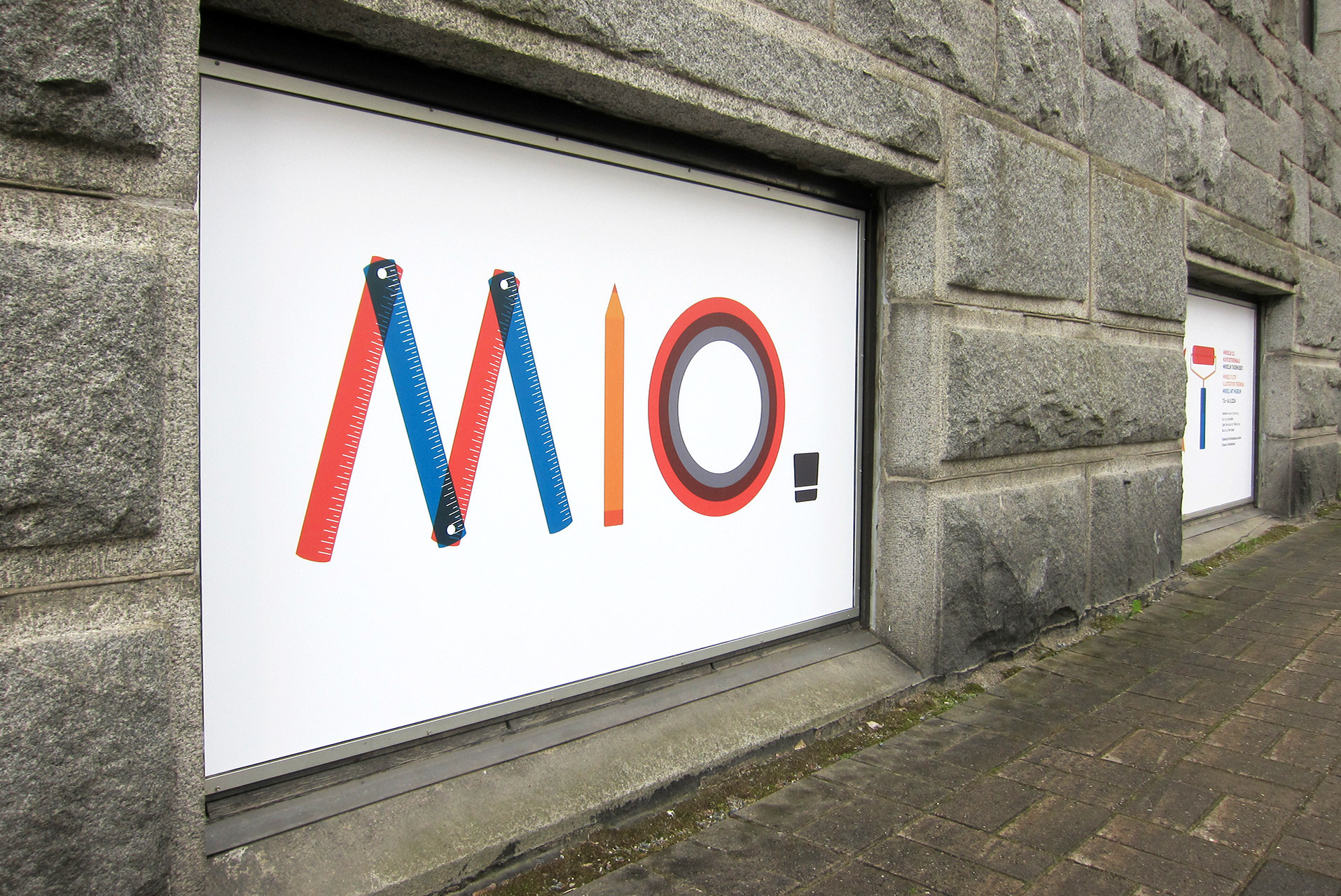
Mikkeli’s 10th Illustration Triennial
Visual Identity

Bermuda Sans
Type Design

Vanitas
Visual Identity