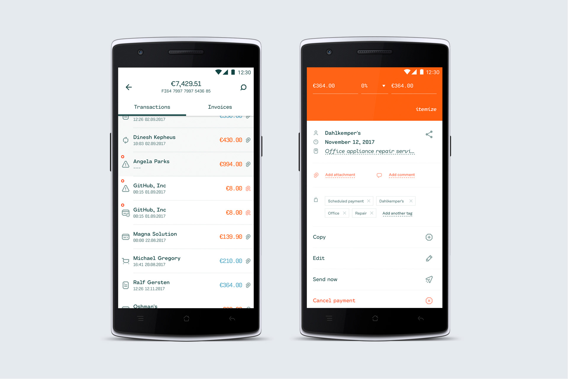
Holvi is a banking service designed for the new era, all about connectivity and full flexibility. The company has Nordic roots (Helsinki, Finland) but it operates as a global community with a team of over 60 members, of 18 different nationalities.
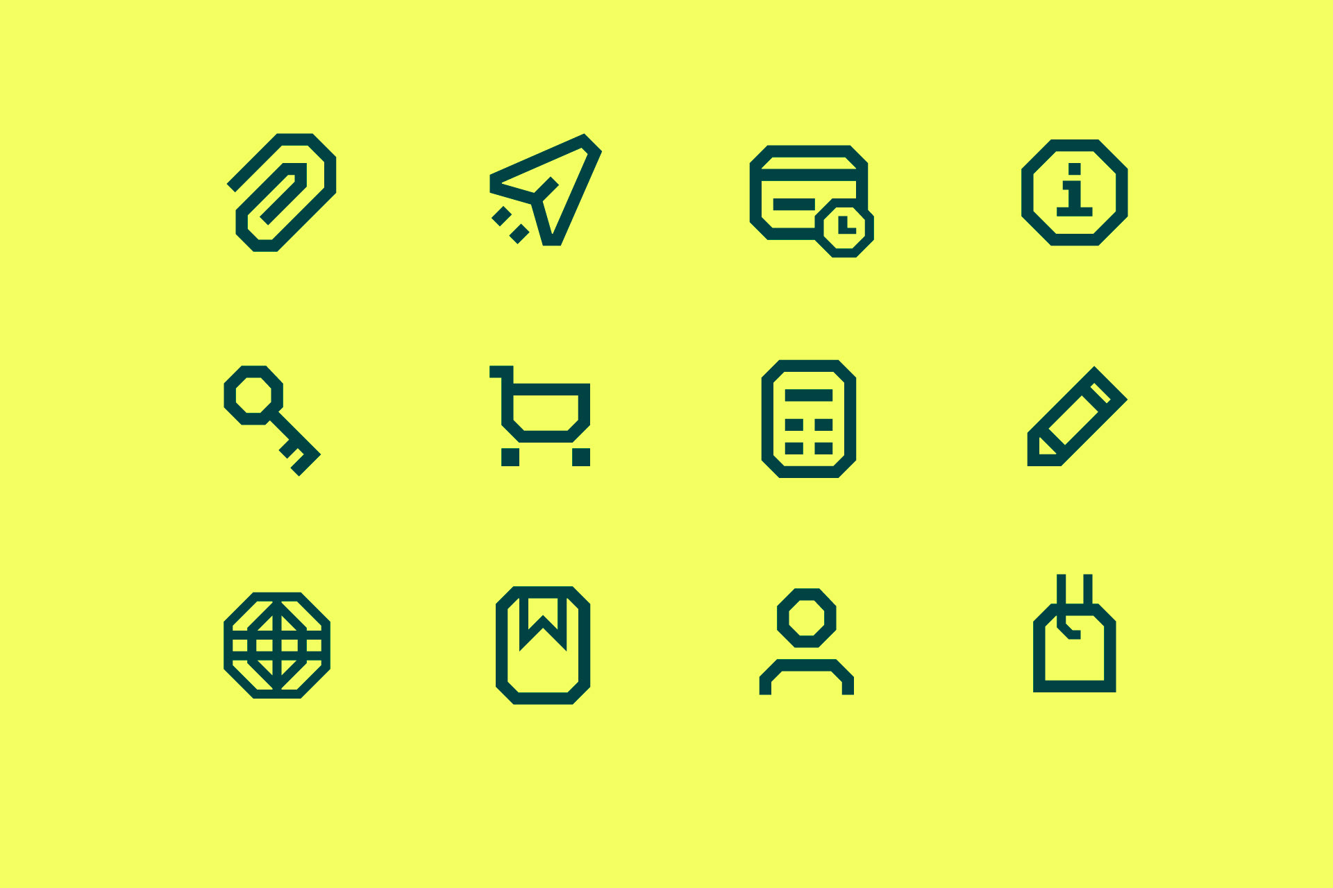
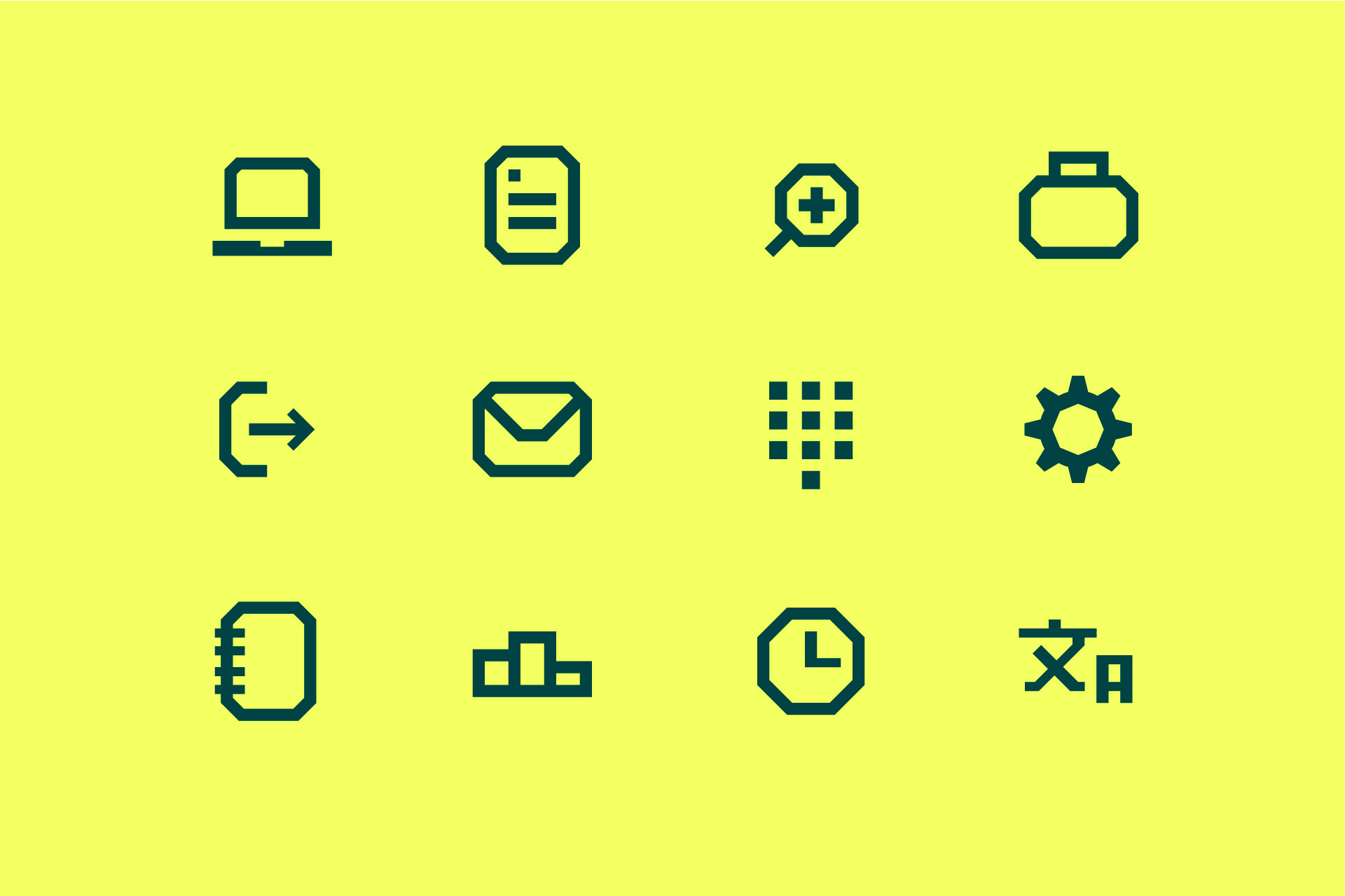
Prakt was asked to design Holvi an UI Icon Framework, guidelines and a set of 45 icons that would match company’s new visual identity.
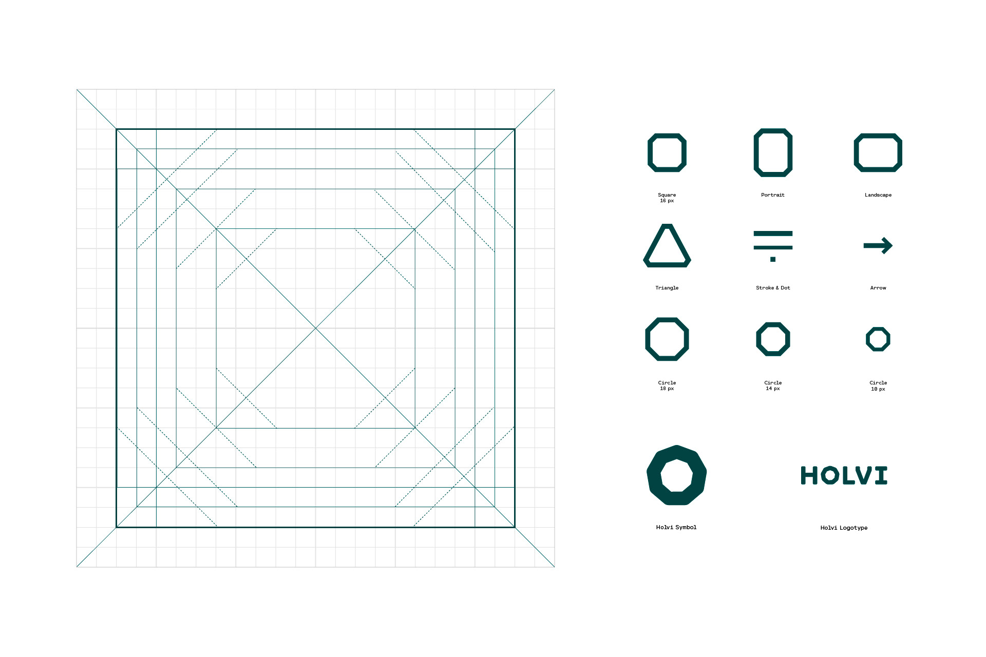
The developed Framework utilizes the same sturdy visual language as Holvi’s logotype and symbol. It aims to set the principles for creating clear and recognizable icons that communicate company’s brand.
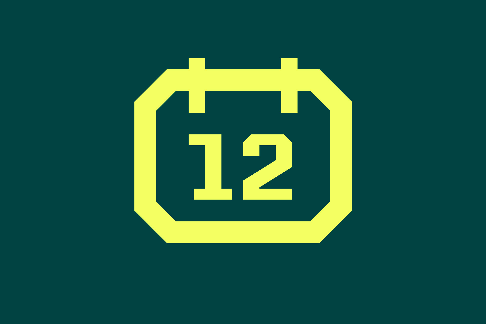
The icons are mainly build with the Common Elements, defined in the Framework, using the 8 point Material grid as a base. Especially the different polygonal-like shapes with 45° angled corners define the character of the icons.
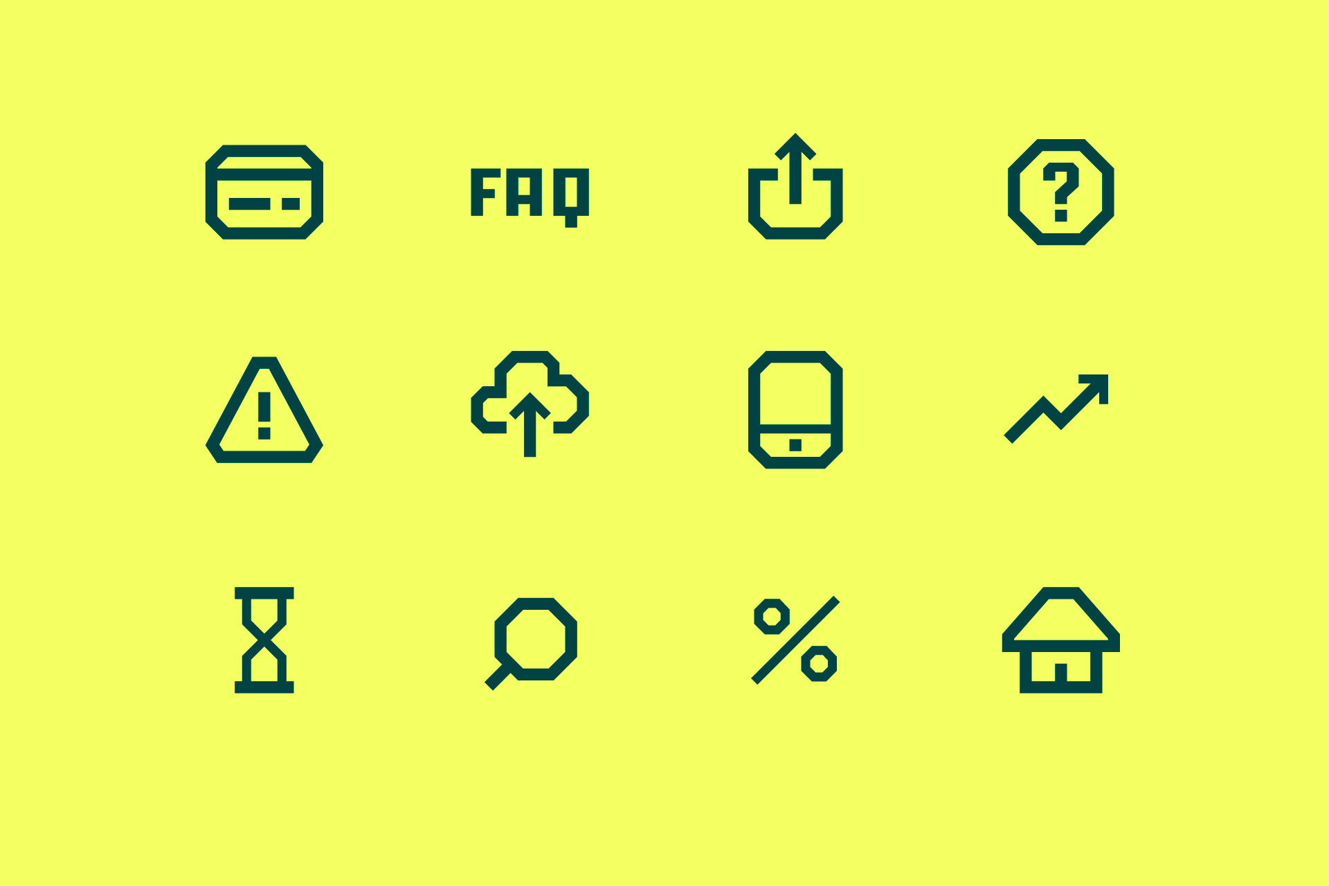

During the process we collected best practices of designing, finalizing and using the icons – as well as “the don'ts” – and created a master file with all needed elements to start working on new icons.
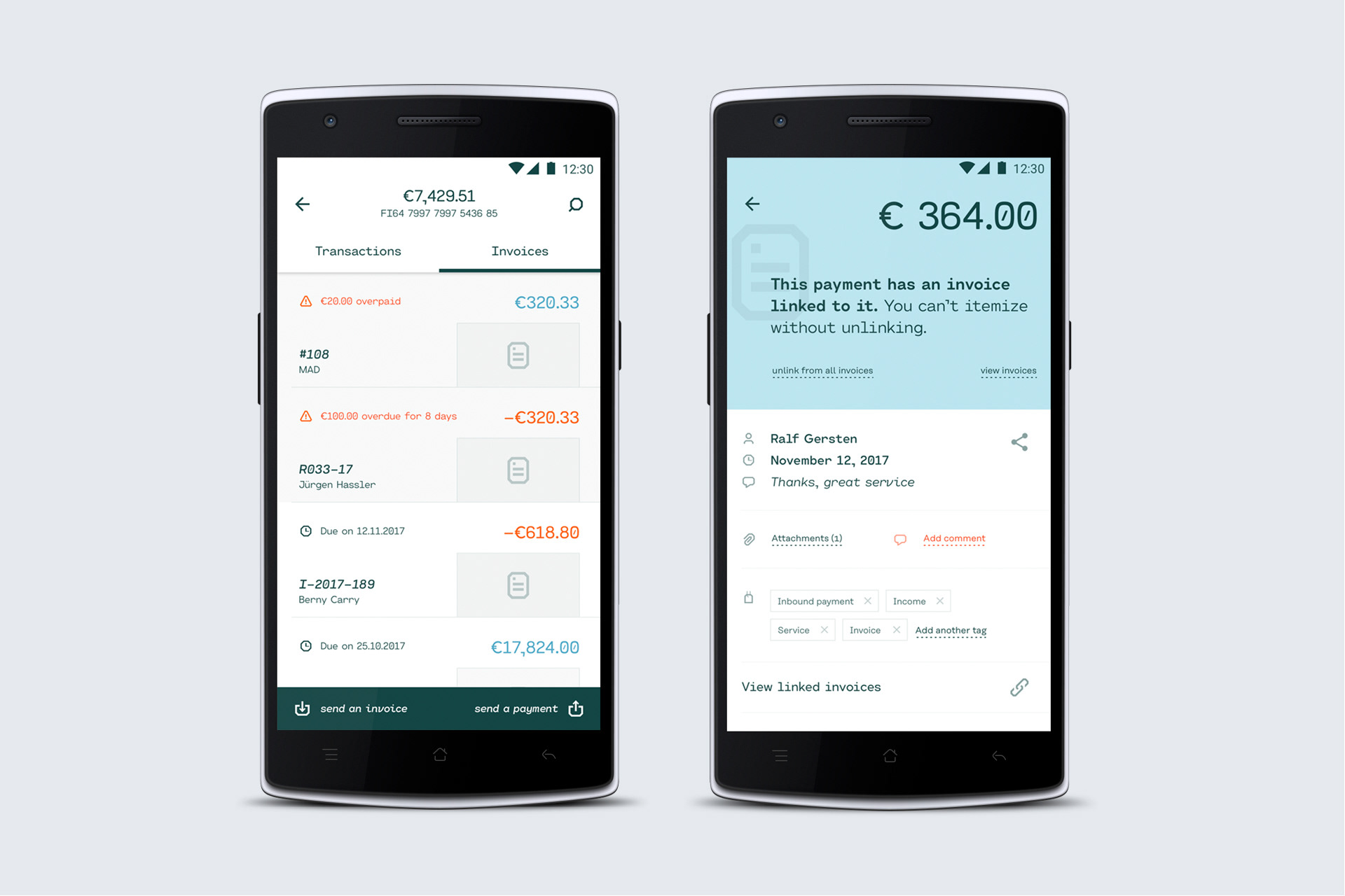
The icons will be brought into use in Holvi's digital services during autumn 2017. The work was done in cooperation with Holvi’s design team.